CHALLENGE
Sensationalise why the everyday Filipino man should go for a stronger cup of coffee — in a way that feels positive and modern, without alienating existing Nescafé consumers.
SOLUTION
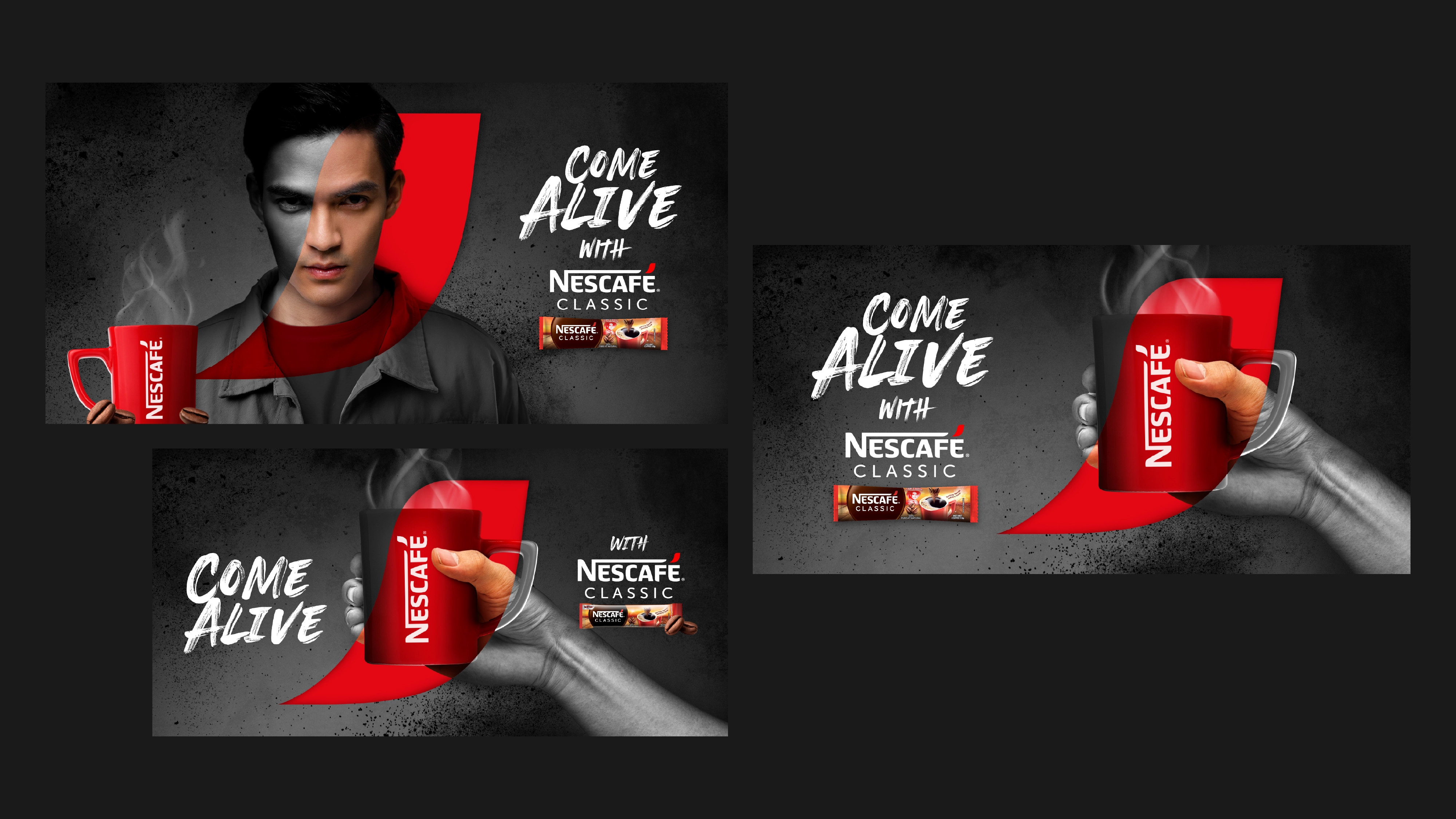
To address this, we brought Nescafé Classic’s bold, black coffee to life through a striking key visual. The creative concept revolves around the idea of coming alive with every sip, which is further reinforced by the campaign headline, “To give you courage,” framing the coffee’s strength and intensity in an uplifting, relatable story that resonates with hardworking men.
Visually, this was expressed through the brand's graphic device — reimagined as a window where colour and life emerge — symbolising the moment of awakening and heightened energy. The bold interplay of black and Nescafé red reinforces the coffee’s robust, intense flavour while creating a confident and dynamic visual language that captures the essence of Nescafé Classic.


Initial creative developments, including visual moodboards that guided the art direction and early key visual concepts. The visual language was originally explored to feel more intense, strong, and high-energy, reflected through bold visual directions and gritty typography.